










 STRIPES
 MOROCCAN
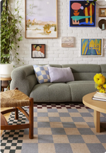 CHECKS
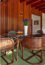 MID-CENTURY
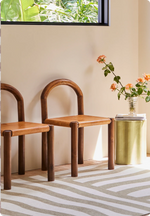 NEUTRAL
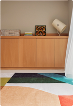 GEOMETRIC
 SOLID
SOLID BORDERS
 KIDS
KIDS OUTDOOR
 ANIMAL PRINTS

That makes it more versatile than its reputation suggests. Rather than designing a room around animal print rugs, consider its scale, colour and construction, then let it become one part of a broader interior.
Don’t necessarily treat animal print as a print
The instinct with a strong animal print rug can be to treat it as the pattern in the room, then keep everything around it relatively restrained. It doesn’t have to work that way.
The irregularity of animal markings has more in common with the grain of timber or veining in stone than with a conventional decorative repeat. Try treating it as another organic layer in the room rather than something every other element needs to accommodate.

Colour helps here too. Look at the individual tones within the print and how they relate to the materials already around it. A warm brown might connect with timber or leather; cream with stone or linen. One shared undertone can be enough. The entire palette doesn’t need to match.
Once the print feels grounded in the material language of the room, introducing another pattern becomes additive rather than automatically competitive.
Scale changes how the print reads
Not all animal print announces itself in the same way. Scale has a lot to do with it.
Enlarge a zebra stripe or irregular marking and the motif begins to move away from a literal animal reference towards something more abstract. At a smaller scale, the repetition becomes more apparent and the print tends to read more recognisably as animal.

Consider how much you want the pattern itself to register. A large, irregular motif can create movement across a room without necessarily feeling busy, while a tighter repeat can bring more concentrated pattern to a smaller area.
A bold rug doesn’t require a quiet room
There’s no need to strip everything else back simply because the rug has presence. In fact, a strong pattern can feel more conspicuous when it is the only expressive element in an otherwise restrained room.

Let other pieces hold their own. Art, sculptural furniture, timber, upholstery, objects and colour give the eye somewhere else to travel and allow the rug to become part of the composition rather than the entire event.
The aim isn’t to disguise the animal print. It’s to give it enough company that it feels like it belongs.
Mix patterns by changing the frequency
Animal print rugs can sit surprisingly comfortably alongside other patterns, particularly when they operate at a different scale.

Think less about whether two patterns “match” and more about how the eye reads them. Broad, irregular markings can work against a tighter stripe, check, floral or geometric because the two patterns aren't competing for attention in quite the same way.
Problems tend to arise when patterns have a similar scale and density. If one pattern occupies more visual space, let the other become the finer layer.
Construction changes the pattern
Pattern isn’t only determined by what is drawn on the surface. The way a rug is constructed changes how that pattern is experienced.

In wool flatweave rugs, a motif can appear sharper and more graphic. Introduce variation in pile and the edges begin to soften, with texture and shadow changing how the colours and forms meet. A familiar animal marking can start to feel less literal and more textural or abstract.
It’s worth looking at construction alongside colour and scale when choosing an animal print rug. The same visual reference can have a very different presence depending on how it is made.

