











 STRIPES
 MOROCCAN
 CHECKS
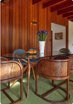 MID-CENTURY
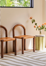 NEUTRAL
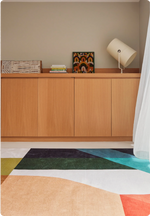 GEOMETRIC
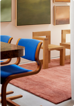 SOLID
SOLID BORDERS
 KIDS
KIDS OUTDOOR
 ANIMAL PRINTS

Colour can be instinctive. We often know when two shades feel good together long before we know why. But understanding a few principles of colour theory can make those decisions easier, particularly when introducing colour at scale.
A rug is a useful place to start. It occupies a significant amount of visual space, but unlike a wall colour, it sits among the other materials in a room: timber, stone, upholstery, artwork and objects. The question isn't simply which colours match, but how they relate.
Start with temperature
Before deciding whether two colours work together, consider whether they feel warm or cool.
Almost every colour has a temperature. Reds can lean towards warm orange or cooler blue; greens can move from yellowed olive to crisp blue-green. Neutrals behave in much the same way. Cream, warm timber and travertine create a very different foundation from grey stone, chrome and bright white.

When introducing colour, you can continue the temperature already established in a room or deliberately interrupt it. A warm ochre might settle naturally among timber, cream and brown, while a cooler colour introduced into the same palette will create greater contrast.
This can be more useful than searching for an exact colour match. Look at the undertones of the materials you already have and decide whether you want to continue them or work against them.
Think about saturation as well as colour
Hue tells us whether something is green, blue or red. Saturation tells us how intense that colour feels.
Two very different colours can sit comfortably together when they carry a similar visual intensity. A muted olive and deep purple, for example, can each hold their own, while softer neutrals around them give the combination space.

Saturation can also create hierarchy. If one element carries the strongest colour in the room, surrounding shades can become muddier, paler or more subdued. Or, for a more expressive effect, several saturated colours can be allowed to compete.
The useful question isn't only which colours you're combining, but how intensely each one is being expressed.
Use contrast deliberately
Colours don't need to resemble one another to belong together.
The colour wheel is useful here. Colours that sit close together tend to create a more tonal relationship, while those further apart create greater contrast. Complementary colours sit opposite one another and can make each other appear more vivid.

You don't need to follow these relationships literally. The principle is simply that contrast can be intentional. A purple doesn't necessarily need another purple to make sense of it; green may be what makes it interesting.
Rather than asking “What matches this colour?”, consider what happens when you put these colours beside each other.
Try working tonally
Using colour doesn't necessarily mean introducing lots of different hues.
A tonal room works within a closely related colour family, creating variation through lighter and darker shades and changes in saturation. This can be as literal as several shades of the same colour, or looser: brown, rust, ochre, amber and cream can create a tonal palette because they share a similar warmth, even though each is distinct.

One colour might appear in its deepest or most saturated form at scale, while walls, upholstery and objects move through quieter variations around it.
The aim isn't to make everything the same colour. It's to create enough variation that each element remains distinct while still belonging to the same broader palette.
Remember that material changes colour
Colour never exists independently of the material carrying it.
Wool absorbs and reflects light differently from glass. Timber contains natural shifts in tone and grain. Lacquer reflects its surroundings, while linen tends to soften colour across an uneven surface. Texture, sheen and transparency all affect how intense a colour appears and how it responds to those around it.

This also means similar colours can be repeated without a room feeling overly coordinated. A shade expressed through wool will have a different presence when it reappears in glass, timber, stone or fabric.
When building a palette, look beyond the colour itself. Changing the material can create as much variation as introducing another hue.
Think about proportion
Colour is also a question of how much of it you use.
A rug covering several square metres carries far more visual weight than a vase, cushion or detail in an artwork. Repeating a colour doesn't mean repeating it in equal amounts.
If one element provides the dominant field of colour, it may not need to appear anywhere else. Or it might be echoed once or twice at a much smaller scale.

Traditional decorating formulas often divide colour into dominant, secondary and accent proportions. The exact percentages matter less than the underlying principle: decide which colour should lead, which should support it and which should appear only in smaller moments.
A strong colour doesn't need to be repeated everywhere in order to belong.

